Betfair charts are broken – Here is the solution!
If you are Betfair trading, it’s important to look at the Betfair charts.
While some sports don’t suit charting, they are really useful if you are trading pre-off horse racing markets. They plot price action and give you some idea of where the general trends are in the market. This can give you clues as to where a market is going or a trend is about to reverse, or stop.
However, there is a problem with traditional Betfair charts.
The big issue is that they cannot correctly plot an accurate price history. That’s a MAJOR problem if you are trying to look at charts for clues.
I often see people highlight ‘opportunties’ in charts, when it’s clear to me they couldn’t have traded the market. Otherwise they would see the ‘opportunity’ is actually an error or optical illusion created by underlying flaws.
It’s been a problem right from the day the Betfair betting exchange came into being, and even with updates and changes, it seems the charts have become even more broken!
This blog post will explore why this is the case, and I’ll provide a solution to these broken charts.
Why are Betfair charts unrepresentative of price action?
To begin, we need to look at how the Betfair charts record their data.
Firstly it is important to note that a Betfair chart is actually generated over many hours. So what you’re actually seeing is deeply compressed information.
The left hand side of the graph is generated over many hours and therefore the price action and volume is compressed on the left side. On the right side of the graph you have the last fifteen minutes or so. These are some key distorting factors.
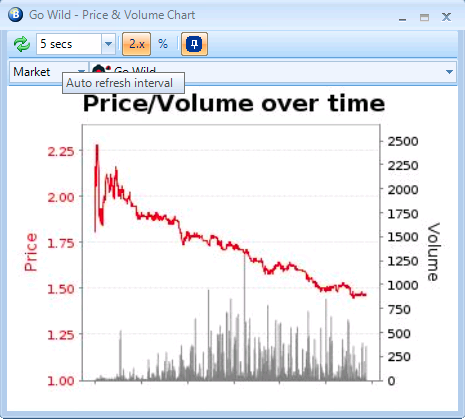
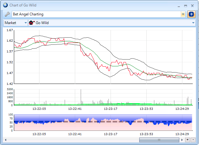
If you look at the example below. You can see consistent backing over the course of the day, or do you?
On the right the timed Bet Angel Charting looks completely different. Compare the two and look at the bottom of the Bet Angel Chart where you can see the timings and how they match with price action on the Betfair chart.


Betfair’s failed attempt to fix the broken charts
Betfair tried to fix the above problems, however, another problem occurred which completely broke the charts!
The charts sometimes decided they would display the wrong information and in some cases, the charts even decided to go backwards.
The most common issue was that when a large bet appeared and moved the price a few ticks, these new charts showed prices that would erratically jump from one price to another resulting in the time scale along the bottom being completely wrong.

So be careful if you’re using the standard Betfair charts because they ARE broken. You still have the old problem of compressed price action and volume, but you now also have gaps in them as well.
In short, if you are serious about trading, you should glance at them, but not necessarily use them seriously.
How to create accurate and insightful charts
So what is the solution to this age old problem.
Use Bet Angel’s advanced charts because they’re just so much better! I know I have a vested interest in saying that. But ultimatley, like a lot of things in Bet Angel, advanced charting was designed to help you. In this case not only with it’s wide range of features and options, but to fill the gap left by the inaccurate Betfair charts.
You can delve into so much more detail, creating a customised chart for your style of trading which can give you a unique view of the market. But also you can zoom, pan and scroll across the chart over time. It will allow you to look deeper at specific moves and learn what happened and why.
Even better than that, on version 1.55 or higher, you can create and plot your own data on a chart using automation to store calculated data. This gives you the ultimate control over other charting options to plot exactly what you want to see.
It seems like a no-brainer to pick the detailed and advanced charts over the basic, broken Betfair charts when trading.
It’s really easy to import and export your own customer advanced charts and to make life even easier for you, you can download some of the examples on the forum: –
https://forum.betangel.com/viewforum.php?f=67
There is a whole world to explore in there!
If you are not familair with Bet Angel Advanced Charting I have produced a 30 minute video on them.
Bet Angel advanced charting: the smart way to use charts
One of the first things we ever did in Bet Angel was to introduce our own charting, and it is something we continue to upgrade and enhance.
Advanced charting has moved on signficantly from it’s early inception and allows you to overcome all the issues with Betfair graphs and significantly improves your trading by displaying tons of customisable information right in front of you.
The advanced charts give you a true plot of all of the price activity, and you can scroll forwards, backwards and zoom and pan. This makes it possible to be able to see everything that’s going on with the market in the correct time frames.
While you are on a market you can also go back and review key moments and zoom in to see exactly what happened. It will completely change the way you look at a market
Summary
Charting is such an important tool when trading, especially pre-off horse racing. I would recommend that you become familiar with the workings of advanced charting and remember not to rely solely upon Betfair’s charts. They are BROKEN and not a true representation of the market.
But also, use them to create your own unique view of the market. Something that only you are familiar with. Doing this will help you get an edge in the market.