General - Name
If you custom create a chart then use this dialog box to name your chart. All charts are listed in alphabetical order so bear than in mind when you name a chart. You may also want to use a name that helps you remember what the settings were.
Chart Style
Line chart
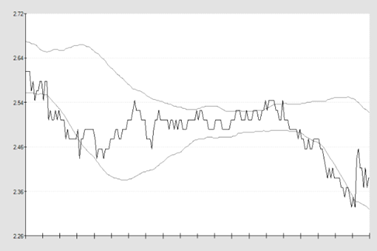
A line chart is simply a representation, in line form, of the data that you want to be plotted on the chart. A line chart simply plots the last available update of data to the chart.
Using the price envelope plot you can ‘frame’ the price volatility of the line chart so you can see how volatile the market looks and key pressure and turning points in the market.
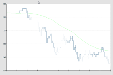
OHLC Bar
An OHLC bar chart plots data over a time period and should therefore be used with a modified setting in the X Axis interval. By this we mean you should carefully decide over what time period you want this particular chart plotted. OHLC stands for "Open High Low Close”.
This chart setting is constructed using the following data: -
1. Opening price: It is taken from the first price of the period.
2. Highest price: Highest price is high price of the period
3. Lowest price: Lowest price is low price of the period
4. Closing price: It is taken from the last price of the period.
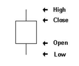
The top of the vertical line represents the high of the period while the bottom represents the low. A small horizontal line on the left side of the line shows the Opening price while the one to the right gives the Closing price.
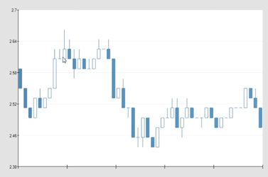
Candlestick chart
A candlestick chart is a style of bar-chart used to describe price movements. It is a combination of a line-chart and a bar-chart, in that each bar represents the range of price movement over a given time interval. This method of charting prices is popular due to the ability to display five data points instead of one.
Candle sticks are composed of the body blue and white, an upper and a lower shadow or “wick”. The wick illustrates the highest and lowest traded prices, and the body the opening and closing price. If the price goes up, the body is white, with the opening price at the bottom of the body and the closing price at the top. If the price goes down, the body is blue, with the opening price at the top and the closing price at the bottom.
With all charting methods there are an immense amount of strategies you can put to use in the markets. As there are already substantial amounts of information available on this we suggest you Google each method to research your preferred strategy.
History List Chart
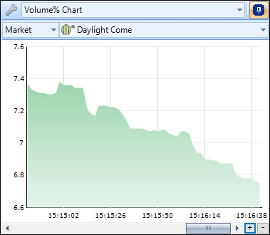
This is a bespoke chart created using data from a Stored Value held in a History List. it is displaying the % share of Traded Volume for each selection in the form of a 'Filled Range from the Base'.
What your seeing in the chart is how a selections share of the traded volume is changing over time. ie, in the image below this selections share of the traded volume has been decreasing.
The large list of data you can store in a history list gives you the ability to create some unique advanced charts and bespoke views of the market other traders don't have.
X Axis
Interval
The interval is the time between each refresh on the graph. You can set to the lowest value to one tick / one price movement. Generally this would make too volatile so people tend to use time intervals. The time intervals range from 500ms to 10 minutes. Time intervals are best used when plotting bar or candlestick charts.
Width / Data points
On the advanced charting you can plot up to 200 data points on the chart. By data points we mean the number of intervals plotted across the screen. Plotting more data points allows you to see much longer term price activity on your chosen market. Less data points means that the chart effectively expands to fill the same area but with less data giving you sharper focus on the time period you are looking at.
Both the interval and data point settings are down to your own personal preference.